
UX/UI Research case study
My Bakery
Enhancing Online Checkout Experience
Online bakery store’s website, enabling customers to browse and make purchases over the internet from the comfort of their homes.


Introduction
Roles
- Interaction (IxD) Designer
- User Experience (UX) Designer
- User Interface (UI) Designer
Deliverables
Interaction Design: High-fidelity interactive prototypes for key tasks on desktop and mobile.
UX/UI Design:
- Competitive analysis
- User surveys
- Site map
- Personas, User Journey map
- UI kit
- Low-fidelity wireframes
- High-fidelity mockups and prototypes
- Usability tests and findings
Project Specifications
Duration: 6 weeks
Tools:
Adobe XD
Miro
Photoshop
Project overview
We are creating a website to help online shoppers find the product they want and place an order online from their homes ahead without standing in line in-store. We need to find out if the main user experience, ordering and finding the products online, is easy for users to complete.
We would also like to understand the specific challenges that users might face in the browsing and ordering process.
To evaluate the new checkout on the My Bakery website, we relied on several usability tests. This allowed us to gain deeper understanding through both qualitative and quantitive infomration.
The problem
While ordering bakery products customers have to wait in-store line, they are wasting their time and sometimes it happens that their favourite products is sold out. They offten feel frustration about time, repeating their order or anxious about what to order.
The goal
To create a new web platform for online shopping with eye-catching content.
To increase business opportunities through better user experience, optimization of information architecture and determin if the website is difficult to use.
Design process
The steps that led to the completion of the study.
Empathize

Define
Ideate

Prototype

Test
Understanding the user
- User research
- Personas
- Problem statements
- User journey maps
Research
I started my research with competitive analysis in order to understand the approaches of the other competition. I also wanted to identify functional and usability gaps by looking at alternative solutions. User surveys would help me understand what is most important to costumers, so I could prioritize it. And lastly, findings from surveys and interviews could help me uncover users’ journeys and help identity their pain points.
Findings
Working adults are too busy to spend their time in-store line. They can´t purchase outside of operation hours.
Customers can only buy a product from the bakery in-person.
Customers would be happy if they had the option to make an online purchase and then schedule a specific time for product pickup.
Persona
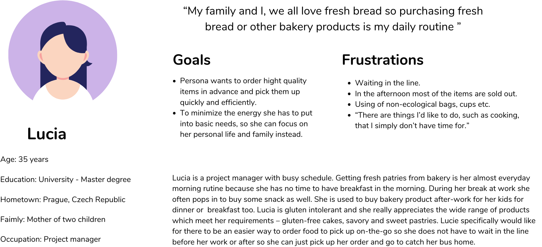
We gathered insights from our finding which helped us in realizing user Goals and Frustrations.
Due to the extensive target audience of this project, I recognized the significance of encompassing a diverse range of individuals. To achieve this, I created two personas. These were designed by cross referencing quantitative and qualitative data from my user surveys and interviews. These personas would play a crucial role as guiding markers for forthcoming design choices.
User Journey map
Here are examples of user journey maps for the user persona of the My Bakery website, Lucie. There are also the goals.

Site map
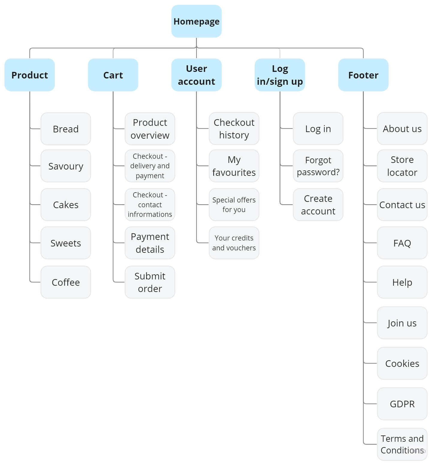
My goal here was to make strategic information architecture decisions that would improve overal website navigation. The structure I chose was designed to make things simple and easy for the users.
Starting the design
- Paper wireframes
- Digital wireframes
- Low-fidelity prototype
- Usability studies

Paper Wireframes
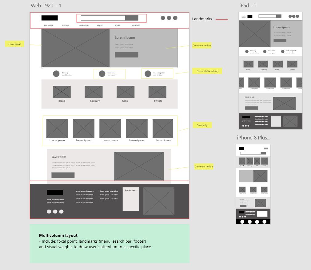
Next, I sketched out paper wireframes. I created 5 screen and one final screen of home page. The home screen wireframe variations show products informations, images of products, search bar, shopping cart and icons.
Enhancing accessibility
To enhance accessibility I used landmarks as menu, search bar and footer the way as users are used to. Focal point would be the very first picture with call-to-action button and thanks to visual weight it will draw user´s attention.
In the wireframe were used gestalt principals thanks to them will users recognize patterns and will group similar elements. To gestalt principals belong: Similarity, proximity, common region.

Designing Information Hierarchy and screen size variations
Because My Bakery´s customers access the site on a variety of different devices, I started to work on designs for additional screen sizes to make sure the site would be fully responsive.
Because of time limitations, I proceeded directly from sketching to high-fidelity prototypes.Working in black and white helped me uncover problems with scale and information hierarchy. And designing responsive mobile wireframes in this mode helped me make decisions about what elements could be relegated to a secondary role due to spatial constraints.
Low-fidelity prototype
The low-fidelity prototype connected the primary user flow of purchasing certain item, so the prototype could be used in a usability study with users.

Refining the design
- Usability study & testing
- Mockups
- High-fidelity prototype
- Accessibility
Usability study: parametres
Study type
Unmoderated usability study
Location
Prague, Czech republic, remote
Participants
5 participants
Lenght
20-30 min
Usability study: findings
Following the initial usability study, it was discovered that users encountered difficulties when starting to use the website. They also expressed frustration in locating specific items, as there were multiple ways to do so. Another notable issue was users‘ uncertainty regarding whether they had successfully added items to their cart. Lastly, users were frustrated by the absence of a pop-up confirmation window for successful payments, leaving them uncertain about the payment status.
These are the main findings:
Getting started
Upon visiting the website, users often experienced confusion about where to begin their search for items.Cart
Users found the process of adding items to the cart confusing.Log in
The majority of users experienced uncertainty regarding their login status, as there was no clear announcement indicating whether they were logged in or not.Payment
Frustration arose from the uncertainty about whether the payment had been successfully processed or not.
After usability study
Following the initial usability study, I made efforts to address the issue of user confusion regarding whether they had successfully added items to the cart. To provide clarity on this matter, the following elements were added.

Before usability study

After usability study

After usability study
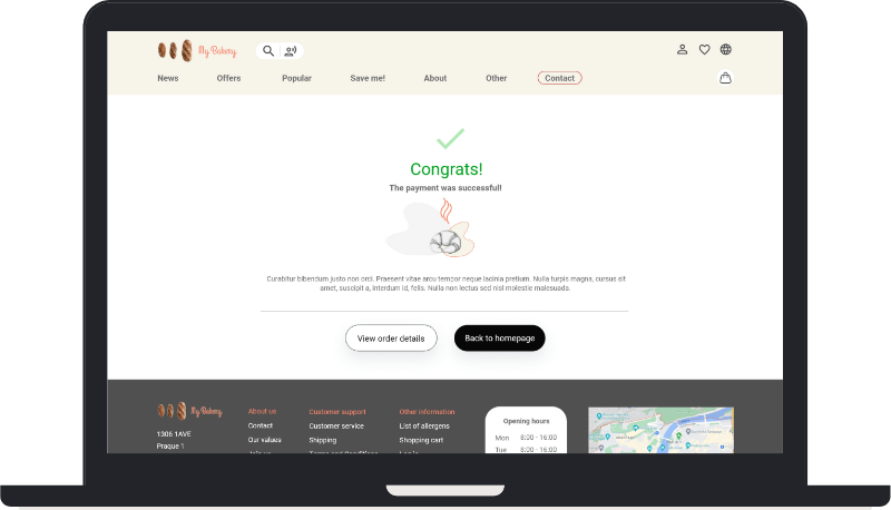
To inform users that their product payment was successful, a payment notification window has been designed and implemented.
Mockups
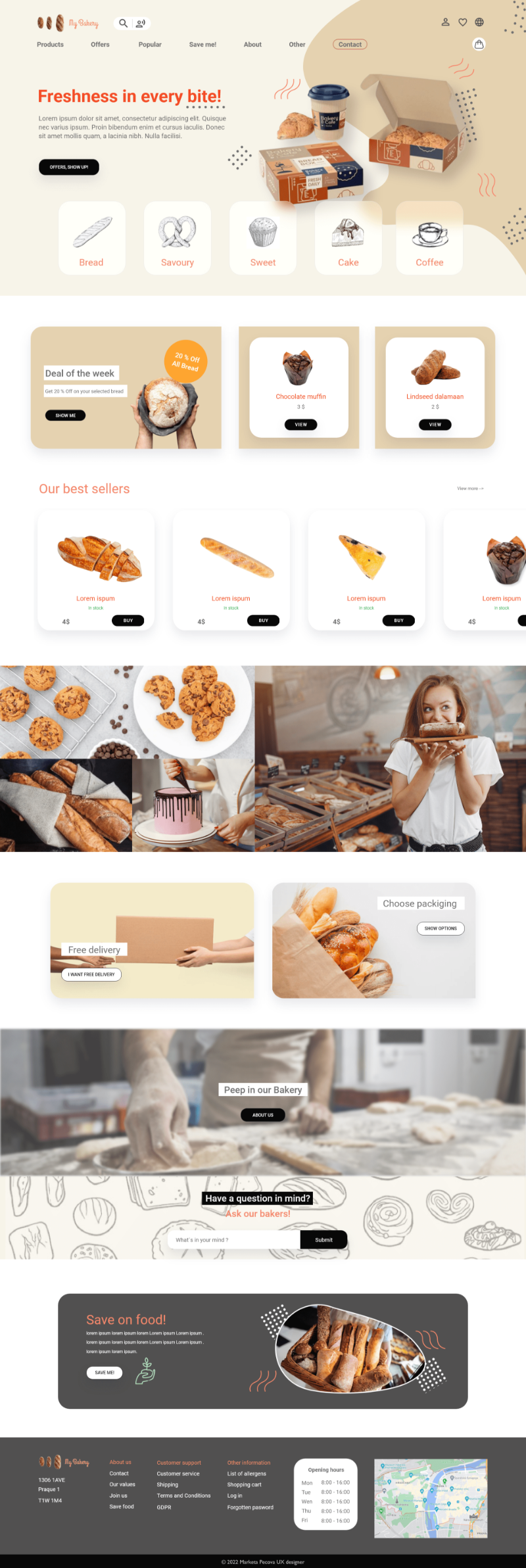
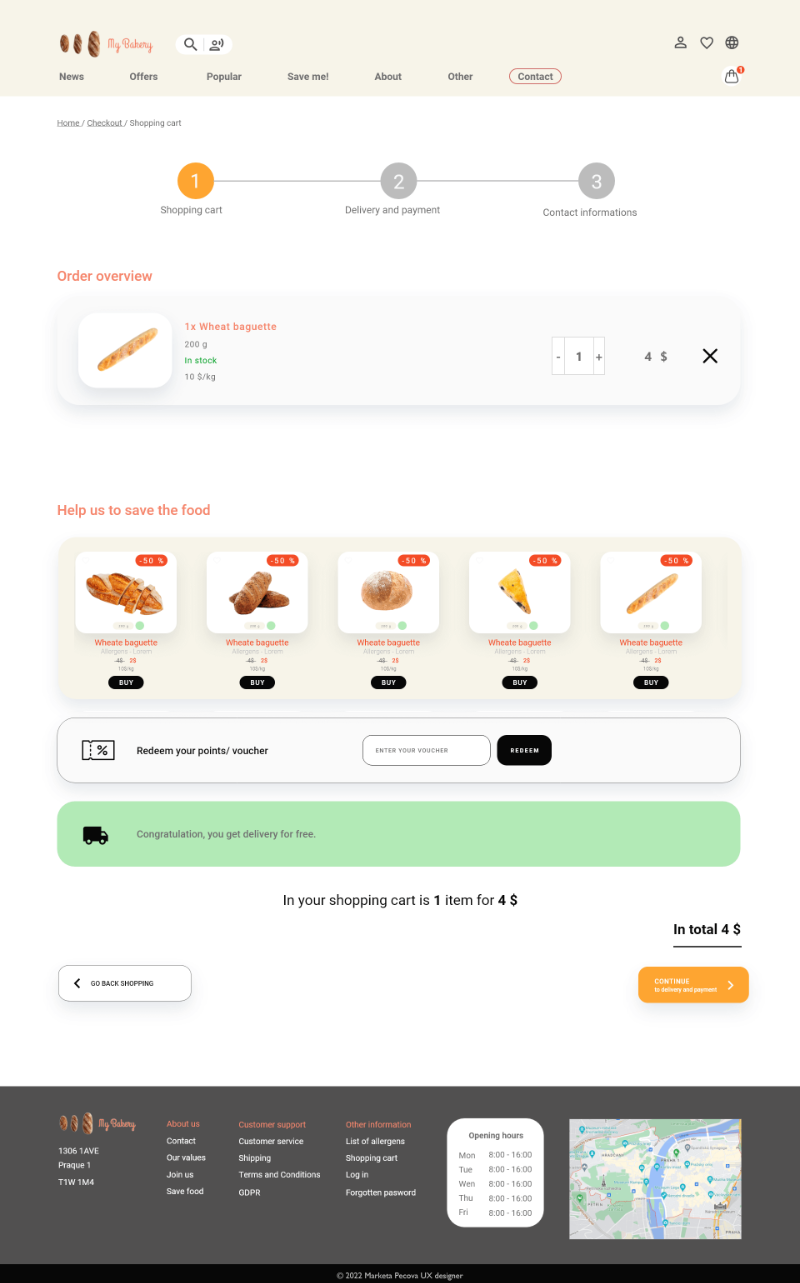
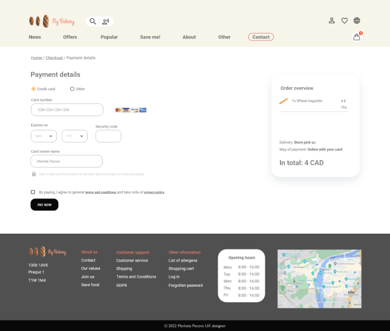
Shopping process
- Searching for product
- Add product to the cart
- Product overview
- Checkout – delivery and payment
- Checkout – contact informations
- Payment details
- Submit order


High-fidelity prototype
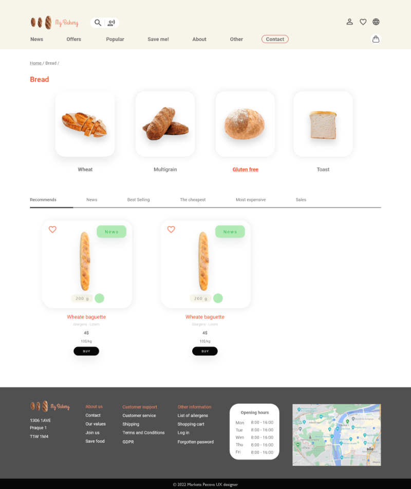
The final high-fidelity prototype presented cleaner user flows for ordering certain product and checkout. It also met user needs for a pickup or delivery option as well as choose exact date of picup or delivery.
View the My Bakery high-fidelity prototype

Accessibility considerations
Provided access to users who are vision impaired through adding alt text to images for screen readers.
Used icons to help make navigation easier.
Animation are under 5 s.
I used landmarks to help users navigate the site, such as menu, search bar and footer.
Good contrast and color provide good accesibility
Next steps
Discussing and sharing my experiences and knowledge.
Conduct another round of usability studies to validate whether the pain points users experienced have been effectively addressed.
Conduct more user research to determine any new areas of need.